Terry Barrett

Activity #6 – Understanding the classification system devised by Terry Barrett in his book “Criticizing Photographs”

Descriptive Photographs

Mug shot of Hugh Grant - Image C\- google images

Mug shot of Hugh Grant
Image C\- google images

Descriptive Photographs are no more than a description of a subject. For example this mug shot of Hugh Grant that we have all seen before. Its purpose is to put a face to a name in a database. Other examples of this classification would be an x-ray, an image from google earth etc.

__________________________________________________________________

Explanatory Photographs

Cancer Patient Image C\- Google Images

Cancer Patient
Image C\- Google Images

Explanatory photographs are exactly that – images that explain or describe a situation. These can range from images as instructions or like here a patient who is clearly very ill and undergoing cancer treatment. To be accurately placed in this category the photograph should provide visual explanations.

___________________________________________________________________

Interpretive Photographs

Image by Cayden Lane Photography. www.facebook.com/caydenlanephotography

Image by Cayden Lane Photography. http://www.facebook.com/caydenlanephotography

Interpretive Photographs are personal and subjective interpretations, more like poetry than a scientific report in their ability to tell a story.

I have chosen this image by Caden Lane Photography of the two children playing with a giant ball that looks like earth. What does this symbolise? Perhaps the two really do have the whole world at their feet.

_______________________________________________________________________

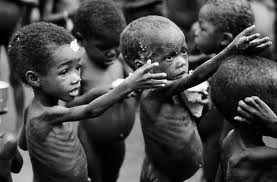
Ethically Evaluative Photographs

Image C\- Google Images

Image C\- Google Images

Ethically Evaluative Photographs describe and make ethical judgements. They show how things should or should not be and are politically engaging and passionate images.

This image of these starving children with their hand out for food show the effects of poverty in 3rd world countries. This image is very confronting, I don’t think anyone could look at an image like this and not feel some very deep emotions.

______________________________________________________________

Aesthetically Evaluative Photographs

Image C\- www.design- seeds.com

Image C\- http://www.design-
seeds.com

Aesthetically Evaluative Photographs point out what their photographers consider worthy of aesthetic observation or contemplation. It is considered “art photography” and consists of, but not restricted to nudes, landscapes, and still life photographs. Basically pictures that are fascinating in their visual beauty.

I have chosen this landscape photograph of the lavender field at sun down or sunrise, Its very simple but also very beautiful or aesthetically pleasing.

_______________________________________________________________

Theoretical Photographs

Colourful Portuguese Umbrella Canopies. Image by Patricia Almeida http://www.flickr.com/photos/vento-na-praia/

Colourful Portuguese Umbrella Canopies.
Image by Patricia Almeida
http://www.flickr.com/photos/vento-na-praia/

Theoretical

Theoretical photographs comment on the issues about art and art making, the politics of art, and modes of representation. They are photos about films, photographs of photographs, art about art, and can be a visual type of art criticism that uses pictures rather than words.

I have chosen these images by Patricia Almeida.The colourful spectacle was created in the streets as part of an arts festival called Agitagueda in Portugal.

Memorable Images

 Sarah Jarrett

Image by artist Sarah Jarrett. www.sarahjarrett.com

For this activity we are to explore the visual aspects that make an image memorable. The first one being of some kind of art work.

To be honest when I was thinking about an image I could use for this activity nothing in particular came to mind and I had to do a bit of hunting around to find an image that I thought was memorable. After searching through many images from lots of different artists, this British artist Sarah Jarrett, and in particular this image was the one that really stood out in my mind.

I think the first thing that really grabbed my attention is the contrast and saturation of the colours used.    I think the image has a sense of balance and the square composition does play a part in this. Despite being a square image the rule of thirds has been applied here, my eye is immediately draw to the eye on the right of the image (her left eye) which would sit at the cross point of the rule of thirds grid.

I find the image quite intriguing, that she has two left eyes which Sarah seems to use this a lot in her images. I’m not quite sure what this symbolises and I’m not really sure that the message is simple, however I do think it’s quite emotional or deep.

 ______________________________________________________________________________________________________________________

tumblr_mcxqqhzXfq1r6k8h5o1_500

The White Stripes. Image c\- google images

Ok, next image – Musical Performer

So for this activity I have chosen this image of The White Stripes.

I think it works really well in that the focus of the image is on Jack White who was the front man of the band, while drummer Meg is in the foreground of the image and out of focus she still has a dramatic & well balanced presence in the image. I guess this also symbolises how they were as a band too.  Both of the artists have long black hair. In this image it is hard to tell who the hair separating their faces belongs too which amalgamates the two, perhaps representing their close relationship. I think this image is a perfect representation of the two and for me is a memorable image.

 _______________________________________________________________________________________________________________

creative-advertisement%20(13)

Heinz Tomato Ketchup. Image C\- Google Images

Advertisement

Ok so again I didn’t have anything come to mind for this activity and I did a google search for advertisement images. As soon as I saw this one I loved it.

I think the use of bold colour again grabbed my attention first. The composition is very simple and effective, Its not too busy and its pretty obvious what its an ad for without having to read any dialogue. I think the caption “no one grows ketchup like Heinz” and the fact that the bottle looks like it is a stack of sliced tomato’s implies that its real tomato sauce. I think its really quite clever and very effective.

Gestalt Portrait

Gestalt Portrait..Ok so our task here is
“to construct & photograph a portrait using related objects, which pays homage to Giuseppe Arcimboldo. Your selection of objects is completely up to you, only limited by your imagination”

Ok so I thought about this for a few days, and what on earth I could use. I tried to break down in my head what we were being asked to do. Then I thought its just a collage of objects right? So why not cut outs from magazines???

I cut out loads of squares from the different skin tones I could find in a magazine, the hair, and obviously the eyes, nose & mouth.
In my mind I was wanting to create almost a side profile portrait. I found the hand in another magazine the next day and thought I would add that to my portrait as well.
Now I’m no Picasso but it kinda reminds me of “Weeping Woman”
This was actually quite fun & my 3 year old got to make his own portrait too which has taken position on our fridge.

Point of View

This was my favourite of the images that I had taken for this task. It was taken from above and slightly to the right of the bunch of flowers. I like this one because you can still see it is a bunch of flowers but the vase doesn't take up much of the image.

This was my favourite of the images that I had taken for this task. It was taken from above and slightly to the right of the bunch of flowers.
I like this one because you can still see it is a bunch of flowers but the vase doesn’t take up much of the image and the subject fills the frame nicely.

The angle of view here is again from a higher angle but to the left of the vase. This image is still quite appealing but there is a lot of negative space, which I think makes the first image most successful.

The angle of view here is again from a higher angle but to the left of the vase. This image is still quite appealing but there is a lot of negative space, which I think makes the first image most successful against this one.

Ok so this image was taken from directly on top, I don't like this image at all because there is no view of the vase so there is no clear message of what the subject is other than a few roses.

Ok so this image was taken from directly on top, I don’t like this image at all because there is no view of the vase so there is no clear message of what the subject is other than a few roses.

This one was again taken from a higher perspective but this time from the right. Aesthetically probably not much difference from the 2nd image really.

This one was again taken from a higher perspective but this time from the right. Aesthetically probably not much difference from the 2nd image really.

This one was taken from a lower angle with the camera facing up to the flowers which is not a visually pleasing point of view for this subject at all. The vase itself and the flower stems become very apparent and obviously not the most appealing part of the subject. I've not included an image which is directly in front of the subject. The outcome would be similar to this image in that  the vase would take up much of the image and not be as pleasing, also because the angle of view of the flowers wouldn't be so great.

This one was taken from a lower angle with the camera facing up to the flowers which is not a visually pleasing point of view for this subject at all. The vase itself and the flower stems become very apparent and obviously not the most appealing part of the subject.
I’ve not included an image which is directly in front of the subject. The outcome would be similar to this image in that the vase would take up much of the image and not be as pleasing, also because the angle of view of the flowers wouldn’t be so great.


Rule of Thirds

This image shows the use of the “rule of thirds”
The baby is slightly centred to the right of the frame and her face (being the focal point) is situated at one of the intersecting points of the rule of thirds grid.

This image shows the babies face centred in the image. Although its not too bad here its not the most ideal frame for the image.

This image shows the babies face centred in the image. Although its not too bad here its not the most ideal frame or composition for the image.

Line & Shape

This image is an example of lead lines in photography. The wires on the chicken coupe direct your eye to my son who is looking in.

Lead Lines – This image is an example of lead lines in photography. The wires on the chicken coupe direct your eye to my son who is looking in.

This image demonstrates the use of V Lines. Although there are many "veins" in the leaf the most prominent are the V shapes. This directs your view along the leaf.

V Lines –This image demonstrates the use of V Lines. Although there are many “veins” in the leaf the most prominent are the V shapes. This directs your view along the leaf.

Ok so the ribbons of the balloon are my diagonal lines in this image. I think they direct your vision up to the balloons, the fact that the 2 boys are also looking in the same direction also emphasises this.

Diagonal Lines –Ok so the ribbons of the balloons are my diagonal lines in this image. I think they direct your vision up to the balloons, the fact that the 2 boys are also looking in the same direction also emphasises this.

This is an image taken of a ride at a local carnival.  The curve in the line here directs your eye across the image. The use of a slow shutter speed also contributes to this I think.

L Shape – This is an image taken of a ride at a local carnival.
The curve in the lines here direct your eye across the image. The use of a slow shutter speed also contributes to this I think.